I’m so excited to reveal the absolutely gorgeous final details for the hardcover edition of Alchemised.
As the instagram announcement mentioned, these special effects will be available on all subsequent reprints and are not exclusive to the first edition. Now, on to the fun part.
This whole process has been incredibly exciting, and occasionally very, very overwhelming. Coming from fandom, I’ve done collaborations and been gifted art for my fanworks, but I’ve never actually been consulted on the process before, and I found it nerve-wracking to suddenly be asked for my opinion on something so momentous and utterly beyond my field of expertise.
The first step in the process was the cover, which began with some long discussions about what the right kind of cover would be. The initial proposal from the art department was a text focused cover, but there were concerns about whether font and minimal imagery would appropriately communicate the kind of story Alchemised is. Font styles often come with particular genre expectations, and because Alchemised is a bit genre-bending and unconventional, there seemed a risk of the book being mistaken for YA or traditional romantasy (which could result in some shock or disappointment). A character-focused cover also seemed at similar risk of miscategorisation.
Since Alchemised is a dark, gothic fantasy, we talked a lot about how to immediately and effectively communicate its genre to a reader unfamiliar with the content. What kind of cover would be best suited to capturing feelings of both beauty and terror that is so intrinsic to gothic fiction? Ultimately, it was decided that the most suitable option would be to go for a more large-scale art-focused cover. Del Rey commissioned Eva Eller, an artist who specializes in neo-Renaissance and esoteric art styles, and with whom they’d worked on other cover projects over the years.
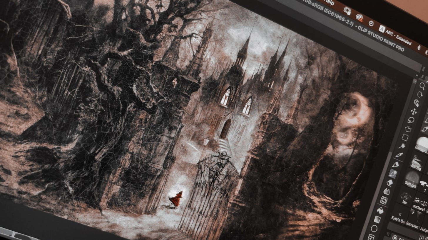
When Eva sent the initial sketches, it fell in line with the atmosphere we had been hoping for, although I did send back notes begging for gothic spires and a big, big house, and, to my gremlin delight when the revisions came back, I got them.
It’s funny, I can’t say I’d given extensive thought to architecture when writing in the past; coming from pre-made worlds, I’ve tended to consider it more as scenery I was accommodating rather than taking ownership of. But in the process of world-building for Alchemised, I found myself spending a lot of time thinking about architectural psychology and philosophy.
Atmosphere is such a crucial element to storytelling in gothic literature, one that is intended to mirror the interiority of the characters. One writer described the gothic genre as one in which “atmosphere is not a flavour but a full course.” Considering the world I was creating through that lens resulted in a very strong and particular sense of what places should look like to communicate specific kinds of history and invoke certain literary allusions, some inspired by my research and others of my own creation.
You can see the stylistic refinement and progression in these three sketches as we got closer and closer to the final (earliest sketch on the left, all the way to nearly final on the right). I really loved what an ode to gothic tradition it ended up becoming by the end. One of my favourite genre quotes is one that expresses the sentiment that romance and horror are like a rabbit and a hare, in which horror (the hare) is ‘the same shape-ish as a rabbit, but it’s different; it’s upturned and eerie and comes at you from a sideways angle… romance is a genre that beautifies loves, and horror is the genre that explores love in ways that aren’t beautiful.’
I’ve always felt that gothic literature skates along the razor edge of those two genres. It’s that liminal space that I find the most interesting to occupy and explore. The Alchemised cover art ultimately captures that feeling well—it’s both beautiful and eerie. It makes your chest catch just a little, and you’re not sure if it’s because it’s lovely or because it’s terrifying.
Later, because of how well the cover was coming together, Del Rey decided to expand the initial concept and make the cover a full wrap as an opportunity to integrate various hints, easter eggs, and details about the story. You will soon learn all about Luna and Lumithia; what flies over the dark forest; and who lurks in the shadows, watching from afar...
And though I already shared the final when we revealed the cover, here she is again in all her glory without the cover, flap, and spine text (below).
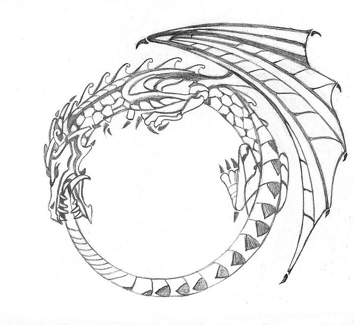
While that was happening, one of the details that I had sent to my editor for potential inclusion on the cover was a dragon ouroboros. While they loved the idea, the team at Del Rey worried something like that would likely get lost and proposed using it as a case stamp instead. I hadn’t known that was an option but immediately loved it. I’ve always adored intricate details like that on hardcovers.
Initially, the plan was to license an existing image of a dragon ouroboros. But alas, while ouroboros dragon art there was, it was imperative that this dragon have wings. And so, Del Rey soon accepted their fate and to my delight commissioned yet another artist, Francesca Baerald, to design one especially for us. The result is so pretty I get tingles looking at it.
Below, an example of some of the pre-existing art (left) and the final sketch of our actual dragon ouroboros (right).

At this point, I thought that between the cover wrap and the case stamp, that was all Del Rey would cook up for the book. I was already feeling quite spoiled with the additional specialized art from the case stamp and the expansive cover wrap.
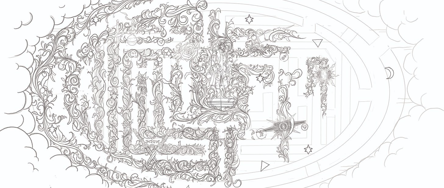
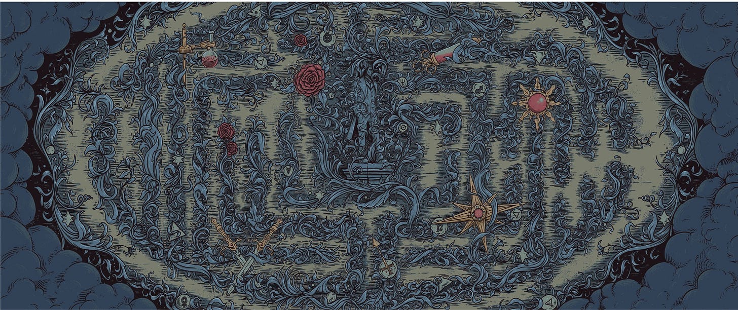
But then, my editor came sliding into my email one day and asked what I thought about reversible dust jacket art. She attached a proposal from the art department about a concept they had in mind.
Dear reader, I have never, at any point in my life, said no to more art.
The next thing I knew Alex Hovey was drawing the coolest hedge maze (below).
I wish I could go into all the details regarding the here and why, but alas… spoilers. You will have to look and wonder and find out in September.
In the meantime, I hope you’ve enjoyed this peek behind the scenes and are as excited as I am about getting to actually hold this beauty in your hands.
Some last housekeeping notes, as I’ve received quite a few questions regarding international translations for the novel.
In addition to the US edition, which will be published by Del Rey, English-language editions of Alchemised will be published in the UK, Australia, and New Zealand by Michael Joseph, an imprint of Penguin Random House UK, and in Canada by Penguin Random House Canada.
The book will also be published in translation in 19 additional languages, with more to come, including: BULGARIAN Ciela, CROATIAN Egmont, CZECH Albatros, DUTCH Luitingh-Sijthoff, FRENCH Hachette Livre, GERMAN Ullstein, GREEK Psichogios, HUNGARIAN Anassa, ITALIAN Rizzoli, LITHUANIAN Baltos Iankos, POLISH Filia, PORTUGUESE BRAZIL Intrinseca, PORTUGUESE PORTUGAL Planeta, ROMANIAN Bookzone, SLOVAK Albatros, SPANISH Montena, SWEDISH Bookmark, TURKISH Destek, and UKRAINIAN Vivat.
Please visit AlchemisedBook.com for specific pre-order information in your country. As pre-order information continues to come in from my international publishers, we will keep the website updated.




This is so incredibly insightful! Thank you for sharing this part of the journey with us, I cannot wait to have the final copy in my hands! Truly feels like a labour of love every step of the way!! You’re always sharing artwork and have done many collabs with artists, so it’s only fitting that your published work gets the most wonderful, thought out, creative results too!
Ohhhhh the hare and rabbit quote ... it really exemplifies what the vibe is in this story ! I cannot wait to read this 😍